I have spent quite a bit of time recently looking at open wargame tables in general on various websites, blogs and magazines, while pondering the merits of using 1/72 scale and 28mm in a small playing space and there is a lot of eye candy out there.
 |
| Part of the new hex board |
This made me think about generally adding some more texture to my own current hex boards.
The following post covers the thinking behind the two new hex boards and some enhancements to existing pieces.
Please tap the 'read more' button to see the results.
First up, while looking at various game tables, a few thoughts had been going through my mind as to the balance between the aesthetic and the practical.
1. Tables that have different textures and shades / tones to the game board / cloth itself look good and break up the 'billiard table' effect, whilst not really getting in the way of play. For my general Kallistra hex boards, I am using their pre-flocked items, because of the quality of the application. Perhaps adding just a bit of hard texture into them here and there and using another shade of flock on one or two hexes (but nothing too obvious) might just add some variation.
2. Terrain glued directly to boards and 'knitted' in to the surface with textures etc looks great, but it is a storage headache. The flexibility of plonk down terrain wins out for me on these grounds alone. So there is a gap between what I want or would aspire to and what actually works best and that is something to simply accept. However, a few dedicated boards would be good to have.
3. Sunken rivers, roads and ditches look superb, but again as per the above point, storage and flexibility has to take precedence in this household. By having plonk down roads / rivers, the same hex boards without rivers can be used for an open featureless battlefield or they can be dressed to give the roads and rivers in the places they are needed .... not where pre-sculpted rivers insist on being. Once both rivers and roads are built directly into the 6 cell hex boards made by Kallistra, then you will need to have a fairly large stock of tiles to configure individual battlefields, especially as the hex grain might run in different directions depending on the rules used - though using single hex tiles does mitigate that to a large degree, but then you are back to needing a large number of singles to get true flexibility.
4. Well made terrain from the Terrain Maker system by GHQ can look lovely and is most often seen in association with the 6mm scale. The dedicated woodland hexes look particularly realistic - but, using a larger scale of figure can often require that terrain in a hex is slightly shuffled around (or even out of the hex) to make room for the unit(s), so having woodland fixed into a base comes at a cost to some functionality when gaming and also goes on to have some storage considerations.
5. The Kallistra hex boards are stackable and remain so with terrain relief added if it is kept really low (5mm or less) and this is a big plus for the space strapped gamer, although a game cloth takes up even less space.
6. From the outset, when first adopting hexes, it may be wise to stop and think whether the user wants to a have a large number of single tiles that can offer maximum versatility or whether the convenience of the 6 hex board is preferred - I initially went with the latter and I see no compelling reason to change.
Workshop - The following section shows some of my existing tiles being 'updated' and also covers the building of the two blank hex boards.
Issue 1 - I am not keen on the texture of the large areas of light brown flock that come with the shell hole and rough terrain pieces. Also, considering they have a lot of undulations built into them, which are very clear to the naked eye, I find that photography, especially with flash, does not really show these pieces up well, as it tends to blow the shallows out.
 |
| Taken without flash but at high ISO and low light to capture the undulations |
To add texture, I started with two good blobs of PVA glue. Into one went a little Sap Green acrylic paint and a very small drop of black paint, this mixed to an Olive Green colour. To the other glue blob, Raw Umber and a tad of black were added. This mix turned into a very black like dark brown.
The dark brown glue mix was added to many of the dips and creases of the piece. The green glue mix was then added to some high and mid points and also blended onto some grassed areas.
 |
| The sharpness of digital photography makes this look a bit scruffy but to the natural eye it looks good on the table |
A small pinch of coarse sand was sprinkled lightly over the piece and then it was rolled into a tray of my own flock mix. Any glue bits not covered, then had the flock sprinkled directly onto it and then the excess was tapped off. Once dry, the flock on the dark brown glue dried darker, which provided natural shading to the lower parts of the piece, giving better camera results as well as giving a stronger effect to visual break up the piece.
The shell hole hexes got the same treatment. I could have gone further with this by gluing in some cork bits for stone and other debris to show explosive force.
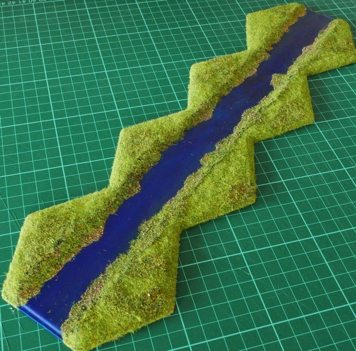
Issue 2 - The narrow rivers (1 hex wide), can look a bit straight and featureless (the two hex wide river system is more dynamic), giving a canal type look. A mix of filler paste, PVA glue, Sap Green Paint and a drop of black acrylic paint was applied all along the bank edges in an irregular way, breaking up the water line and bringing the mix up into the bank, so that it would all knit together.
 |
| Original pre-flocked river section |
Once dry, the newly laid paste was coated with PVA glue tinted with Sap Green Paint and a drop of black acrylic paint. Some stoney sand was sprinkled lightly into the glue here and there, followed by a sprinkling of my own flock and then the Noche grass flock from Kallistra (that is used for their hex terrain) went over anything that still had exposed glue, helping to knit the paste edge back with the pre-flock surface. The darkening of the banks helped give a sense of depth. Just doing one length of bank, one hex at a time, meant that the glue remained wet enough to allow me to go through this three stage process for each individual hex. The best way to apply the Kallistra Noche grass is to rub it between finger and thumb and sprinkle it so that the fibres are dropped individually.
I have some artists acrylic gloss gel and have seen how others apply this to water areas to give reflection and texture (ripples). I thought long and hard about whether to do this, but as the table is directly under lights, it would probably be too reflective and an overall distraction over the course of a typical game and potentially spoil camera shots. It may be something to re-consider at a future point.
Once the river sections were complete, a little glue mixed with green paint was dabbed just here and there on the open grassed area of the river hex and a flock mix added just to break up the grass, though is not too obvious - it makes for a good effect. This particular flock mix was made with a pinch of coarse basing sand, a pinch of Kallistra Noche grass and a pinch of my own base flock mix. This is also going to be added to a few of my plain grass boards, just here and there (see issue 5 below).
 |
| The straight banks have been given an irregular look |
I had been minded to build up the river banks with paste to accentuate the sense of the water being in lower ground, but decided that this would interfere with the river pieces stacking on top of each other, so for now just the above technique to the banks and waters edge will be used, so that the water has a natural shape and shading to it.
For the river end pieces, it seemed likely that such locations might well sit next to boggy ground, so they were given a liberal application of my own flock, so that they looked like rougher ground and could match up to the existing (home made) marsh pieces that also use coarse flock.
 |
| End of river section sitting next to a marsh piece |
Issue 4 - I really don't like my 10mm plonk down wooden fencing or walls just placed out onto the terrain - they are quite nice pieces but just don't sit right. They look a bit weedy and really do look like they have been just plonked down and then they get knocked out of place during play and the individual sections become obvious. I will take this opportunity to use some of them on the two blank terrain boards I am working on, so that they can be melded into the board to give a more natural appearance.
Issue 5 - When the hex boards are laid out to make a fairly open landscape, all that grass looking back can give a bit of an anonymous feel. To break up the battlefield, every third large tile was given a bit of extra texture. Kallistra actually do a two tone flock effect tile which does the same thing.
 |
| The photo makes this look darker than it really is - it is rather more subtle |
Mixing PVA glue and some Sap Green acrylic paint with a drop of black, gave a sticky dark green gloop. This was just roughly dabbed on a hex or two and then sprinkled with a prepared mix of flock (1 pinch coarse sand, 1 pinch my own flock mix and 1 pinch Kallistra Noche grass) patted down and allowed to dry.
 |
| It knits into the original surface quite well. |
The idea was that these additions would (1) look interesting but not be too distracting to the eye (2) be suitable for multiple periods (3) be low enough not to interfere with the stacking of the tiles or the addition of other terrain that might have to sit over it (such as a building or even woods etc). I noticed that one of my Kallistra hills bought at a show has the official two-tone green/earth pre-flocking, rather than the standard green/earth, which I normally go for. The shape of the two-tone hill is picked up better by the camera as the extra colour of flock seems to highlight contours and as mentioned above, the extra flocking added here has much the same effect.
 |
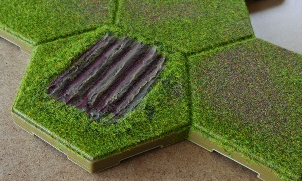
| Cultivated ground. |
Finally, I added some cultivated ground to one hex. A paste mix was made from base filler, some PVA glue, a squirt of Raw Umber acrylic paint and a drop of black acrylic. An old credit card with one edge nicked with a row of 'V's was then dragged across the surface to give a sort of low furrow look. When dry, it was touched up with acrylics.
 |
| This gives the overall appearance of the changes to the boards as ACW infantry march by - perhaps in the search of shoes! |
Issue 6 - It has nothing to do with hexes, but my smoke markers feel a bit weedy and now seemed a good idea to do something about that. Since they are just markers that can be move around within the hex as needed when units move into the hex, they can be more substantial than their Tiddly-Wink base allows. They just needs some bigger bases (Like the spare plastic bases from my 28mm box of Perry figures) and some cotton wool balls (just £1 a bag from the cheap shop).
 |
| Left - original smoke marker. Right - new smoke marker |
The bases are 45mm x 20mm and can take two cotton wool balls. They were glued (hot gun) to the base and then the cotton was slightly teased upwards to give the impression of thinning smoke. Finally a very watery mix of PVA glue and cheap grey acrylic craft paint was dabbed on here and there to mucky up the smoke. I am still a bit unhappy with them, but they are better than the wisps of smoke they replace.
Blank boards - These were bought just to bring something new and bespoke to the battlefield. From the outset they were meant to integrate with the existing grassed boards, so the shopping list also included a bag of the Kallistra Noche grass flock, which they use on their pre-flocked boards. This was to be applied to the edges of the new blank boards so that they would knit in better with the existing terrain boards. The question here was whether to fix the buildings into the board or have them as plonk down extras? I had pretty much decided to leave the buildings off - but having done something similar before and seeing how effective it looked, at the very last minute I caved in and added the buildings to the boards.
My local shoe shop provided two (more) empty boxes that had once housed ladies boots. They are 18" long x almost 12" wide, so two stacks of kallistra tiles can fit in them side by side (probably 12 tiles worth). The stacks can be kept down to 2 or 3 standard grass tiles and then these bespoke terrain boards can sit on top of them. Storage wise, this seems to be the most effective way to do the job.
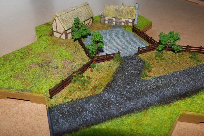
The first board is a farmyard type complex that could then have field hexes or orchards placed nearby. There is quite a lot going on here. Two hexes will count as buildings and one as an open cobbled courtyard. Three layers of card (mount board), covered with one of those plaster impregnated bandage things will give one hex a mound shape (low raise) which can have rough texture on it. It will just count as 'open' in play, but will give the eye something else to look at.
 |
| The trees have their wire trunks splayed out at the bottom and fixed into hot glue. |
The remaining two hexes were left blank to allow a road to go down to connect the tile with the road net. The board also allowed for some fencing to be fixed into place, plus a few trees (from Pendraken) since the buildings are higher than them, so the space may as well be used as it will not effect storage.
 |
| Completed board |
And here is the completed board (above). The road has been added and this matches my current road sections (edit - well it did, I have just bought some S and A Scenics roads - Doh!). The mound (middle left) was given a coat of paste, but left fairly rough, so some of the rough paste would show through the sprinkling of coarse sand and flocks. It more or less disappears here in the photo, but in the flesh it looks subtle but nice.
 |
| The mound is on the left and hard to pick up on the camera |
All the board edges have been flocked with the same Noche flock as Kallistra use on the pre-flocked boards, so they will mate nicely with what I already have.
 |
| A rear view, a pathway has been added |
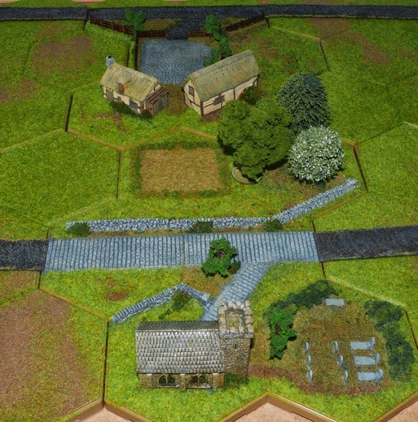
The second board was to be a bit more 'edge of village' in style, with a church, graveyard, a cobbled street and plenty of stone walling and some hedging. There is space on the board for a village green and some park land (plonk down trees will go there).
 |
| Bottom right, the end of the wall is shown in a collapsed state |
The buildings on both boards are from SHQMiniatures and although all are described as 10mm, the church feels undersized compared to the cottages - though the small footprint is appreciated on these boards.
 |
| Sorry, this is a bit dark. |
And here is the completed board (above). A village green has been added on one of the empty hexes (top right) and parkland below it (this is textured as rough in case I want to leave the hex as open, but can also have trees added as shown below - as can the green).
 |
| A brighter shot of the above scene |
The graveyard is linked to the church by a path that is not visible in this shot.
 |
| This has the 'plonk down' trees added to the rough parkland hex. |
These two shots show how easily the scene can be transformed just by adding trees to the parkland hex.
The two new boards were built in isolation of each other and I should have given more thought in the planning stage for the two boards to work together. On the church board, if the positions of the church and village green had been swapped, a cluster of three buildings could have been created when the boards were side by side (see below).
Also, it would have been better to have left out the side fence on the cobbled courtyard and ensured that the cobbled road from the church linked directly (if needed) into the courtyard piece by bringing the cobbles to the edge of the hex. The road could also have been re-directed (thus missing the church). The courtyard links directly to the road network, so this would have been a nice way to get the church board connected to the road net (see below). However, it is easy enough find better ways for these tiles to fit into the battlefield.
Conclusion - Anyway, just for the purchase of two new blank boards, some grassy flock and assistance from my own scenic box of glues / paint and flocks, I am quite happy that this 'make-over' has brought my table on quite a bit and I am sure that both tiles will see a lot of service.
RESOURCES:
Article on building a cityscape in hexes.
Link to site on how to make sunken rivers for hexes


Excellent job on jazzing up your existing boards and creating new ones. They all look very nice.
ReplyDeleteThank you, I would like to do a few more, but stage space is the limiting factor for me. An alternative might be to model some items not the 2 and 3 hex thin hex templates and then they can just sit on the tiles in various arrangements.
ReplyDelete